Adoption Tracking Dashboard
The Challenge
This dashboard sought to help BI teams understand and improve user adoption of analytical applications. We hoped to provide visibility into not only which applications were most frequently used & not used, but also who made up the user base, and whether their usage matched the intended purpose of the app.
I started out with some How Might We questions:
- How might we improve the quality of interaction, not just the quantity?
- How might we capture adoption metrics that somehow point back to the individual use case of the application? If we were to define the goal of the application that we’re tracking adoption in, how might we show that the goal of the application is being met, through adoption?
- If we can see the sequencing of pages visited, how might we use that to compare against the “expected/set workflow,” to see if users are adopting the application from beginning to end?
Research
To first get an understanding of what the market need was, I interviewed five different co-workers, all of whom have interacted with various organizations that wanted to increase adoption and didn't have easy visibility into how. I asked them to share what they heard from the perspective of an Executive persona, a Director of Analytics, and an Analyst in charge of tracking and improving adoption.
I learned that an executive would primarily be interested in seeing whether the investment in analytics was profiting, as well as to get an understanding of who on the team was using analytics, and whether those people were performing better. Alternatively, the analyst or head of analytics would be interested in knowing when adoption metrics are signaling for certain action to be taken, whether it's to re-design an application, invest in training, prioritize/promote certain apps, or resolve certain performance issues. They'd monitor adoption or certain applications to try to understand why it's either increasing or decreasing, particularly in the context of the entire environment.
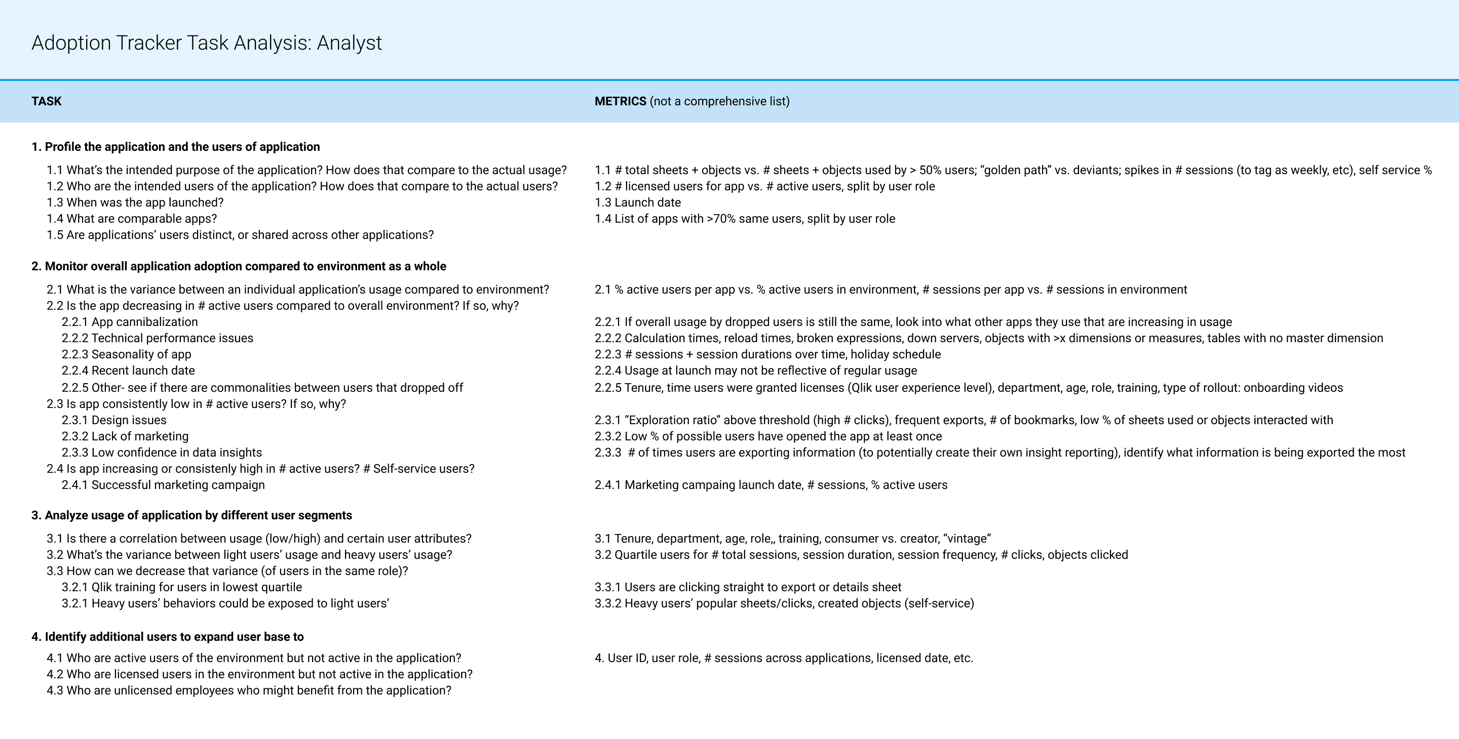
I summarized the proposed tasks of an analyst below (assuming that there are a few select applications that they're especially interested in monitoring, perhaps because of the cost & visibility of them):
Ideation
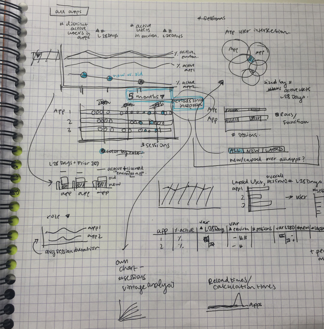
I began brainstorming visualizations that would provide insight into all applications at once, as well as dive deep into usage of a single application.
Solution Walkthrough
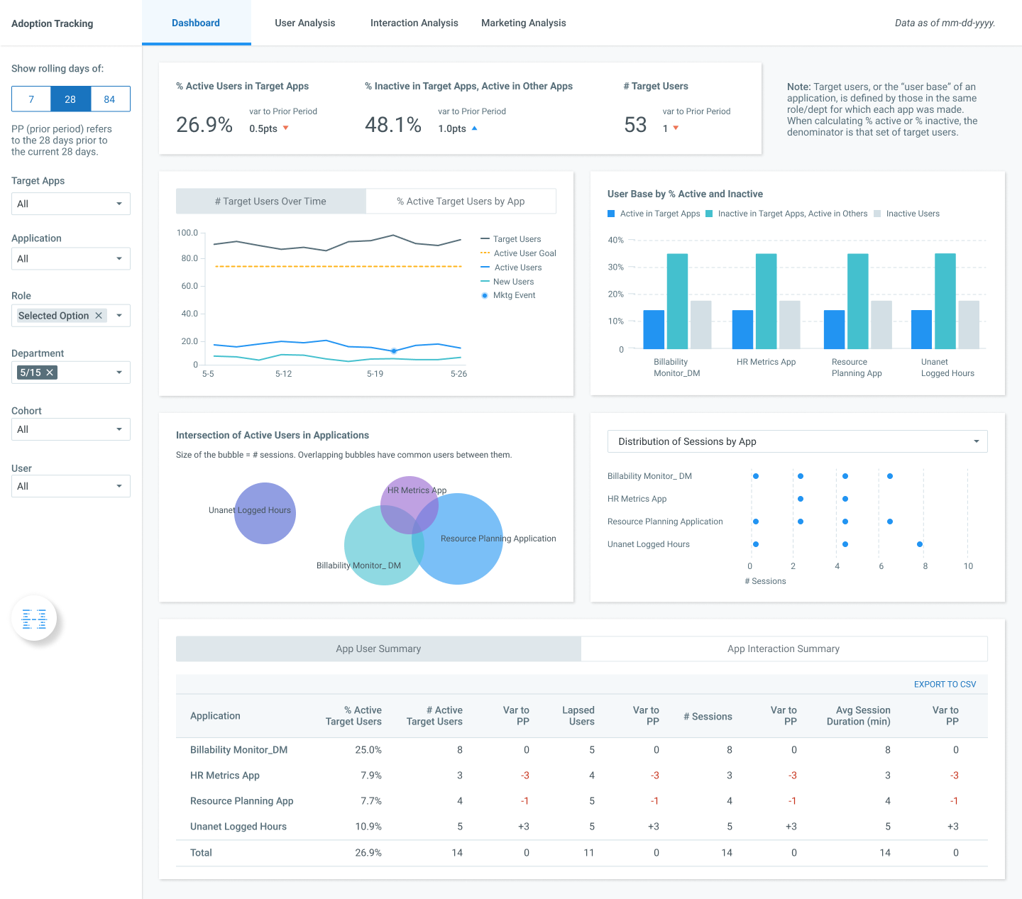
Dashboard: The first screen provides an overview of active & inactive users in the target apps, highlighting users who are inactive in the target apps but still active in the environment as a whole, since this is where the most opportunity is for growing the user base. Analysts can use this screen to see if the user base is growing, if adoption within user base is growing, and how it's growing relative to the environment.
A hypothetical user flow on this screen could look like:
1. Notice that an app has been dropping in % active users.
2. Identify at what point they dropped off, and if correlates with any performance issues.
3. Determine if they're still active in other apps, and if one of those other apps is a target app. Investigate app cannibalization use case.
4. Go to the next screen to determine what user segments stopped using the app.
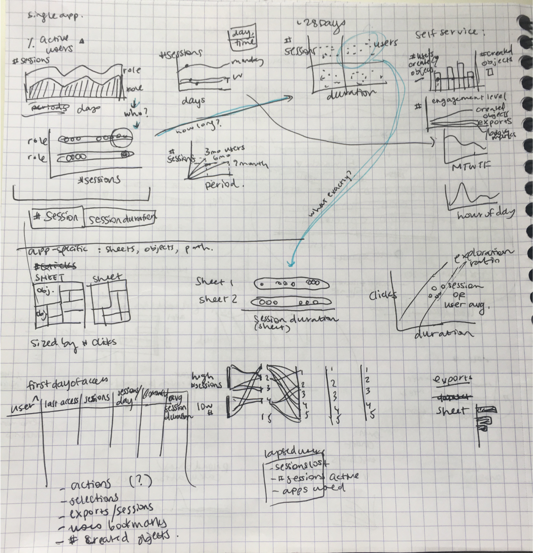
User Analysis: This screen dives into adoption for an app based off of user roles and pre-defined cohorts (i.e. users who were on-boarded in 2016 vs. 2017). It explores these segments over time, by retained vs. lapsed, and for both session count and session duration, allowing an analyst to answer questions like "what organizational roles benefit most from this app" and "was there a rollout method or a marketing campaign that looks like it was more successful, based off the cohort analysis?" Additionally, looking at the roles of users could serve as a loose proxy for understanding the purpose of the application.

Interaction Analysis: The last screen dives into the specific interactions on the screen, looking specifically at the # selections, # objects exported, # objets created, and # bookmarks. Unfortunately, it was too cumbersome to pull data on specific interaction flows, but at a base level, this sheet allows an analyst to get an idea of how a sheet is being used. Here is where we might start getting glimpse into the quality of interaction, and not just the quantity.

JESSIE LIAN
Let's make meaning together.